If you’ve visited the coLab at any point during the last few months, you’ve no doubt noticed that there have been some…ch-ch-ch-changes.

Time may change us, but we can’t trace time.
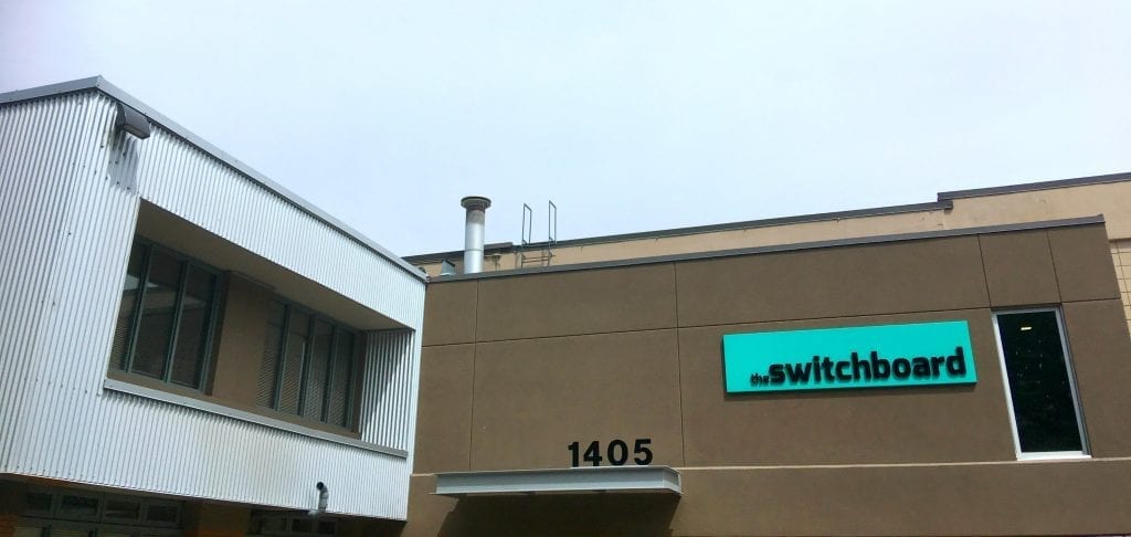
First there was the addition of coLab West Campus. Then we unveiled the new logo and removed that dumb annoying plus sign from our name. And then after that, we took over the space previously occupied by Accelerate Okanagan and doubled our floorspace.
And now, these evolutions are going to be reflected in the coLab brand and communications. That’s right: It’s coLab TWO, y’all!
So what’s going to change, what’s going to stay the same, and how is all of this going to affect you? Here’s what’s been going down and what you need to know.
The New & Improved coLab Brand: Our Philosophy and Approach
The rebrand process started with the new logo designed by Community Activator Kodie Beckley. Kodie’s logo was unveiled earlier this year at a community town hall and was announced on the blog.

After that came some physical rebranding of the space itself. (You may have noticed the bright pink on the wall in the kitchen that Shane tossed up there over a recent weekend, as well as the new furniture provided by Evolve Design Build.)
And as coLab space was starting to look all pretty-fied and whatnot, our attention inevitably turned to the website. The old coLab website was outdated, too inward-focused, and too bland, and it was no longer supporting our mission to make our members our number one priority.
And so, a council was called. From the farthest reaches of the room, we assembled a crack team of professionals to establish a new brand – one that bursts with alacrity and instils hope in the hearts of freelancers, solopreneurs, and startup founders all over the Okanagan.
A meeting of the Fellowship of the Website was convened, where we took a roll call of the fearless few who would modernize the brand:
Shane Austin, the Taskmaster.
Kodie Beckley, the Pixel Wrangler.
Mike Straus, the Punslinger.
Daniel Jones, the Shutterbug.
And Jordan Perrey, the Web Warrior.
We decided on a brand persona that would better embody the coLab spirit. We determined through observation and analysis that coLab is:
- Charming
- Inclusive
- Resourceful
- Nerdy
- Fun
- Creative & Curious
- Knowledgeable & Helpful
- Open & Friendly
- Smart, but not unapproachable
- Supportive, but not high-handed
- Casual, but not careless
And a whole bunch of other awesome things.
After a series of strategy sessions, we chose a direction that would feature our members more prominently in the brand and showcase the value of the coLab coMmunity. The coMmunity is ingrained into every aspect of the new website, from the members grid on the home page to the guest author function in the backend admin area. This is your website as much as it is ours.
Big New Personality, Big New Amenities. Same Great Space, Same Great People.

These are just a few of the shiny, happy people you’ll run into at coLab.
But the website is just the beginning. We’re actively working to incorporate this new coLab brand into the physical space in more obvious ways. (Renovation season is almost here!)
And while the rebrand and expansion is going to give us lots of great new amenities, we’re still committed to maintaining and enhancing the same community-oriented “feel” that exemplifies the coLab brand.
We’re not changing the coLab brand. We’re tweaking the brand to make coLab more like itself and more like you.
Which brings us to our next point…
How This Affects You
First of all, you’re going to have more opportunities to get involved in coLab initiatives. We’re actively working to better incorporate our members into the coLab brand, and we’ve got some plans we’ll be rolling out shortly to make that happen. For instance, coLab members will now have the opportunity to be featured on this very blog by contributing a guest article. (Contact coLabber Mike Straus at [email protected] for more details.)
Secondly, you’re going to have improved access to more amenities and services throughout coLab, both in the physical space and online. We’re making our website easier to use, and we’ve also created a guest blogging interface that will streamline the guest blogging process.
And finally, we’re looking for more and more member input on everything coLab. We want this to be your space. That’s why we created the Advisory Board. And now, with this rebrand, we’re taking it a step further. We want to know: What do you want to see in the coLab brand and the coLab space?
Let us know – email [email protected] with your feedback, or post your comment below.


