We’re sailors on the ferocious seas of freelancing, the endless expanses of entrepreneurism. Braving the storms of uncertainty, crashing through waves of doubt. Looking across the bow and out over the horizon, Shane and I saw the expansion of co+Lab approaching ever faster. We knew. It’s time for a refocusing, a reevaluation.
A rebirth.
When you’re reborn, the familiar becomes strange and the strange, familiar. Old friends become new acquaintances. And rekindling that friendship means showing people the new you, all over again.
It’s taking everything about yourself and compressing it into one thought, one image.
That’s what a logo is, at least in theory. It’s a symbol summarizing all the thoughts, goals, and history of an organization. There’s a lot of power stored inside of logos, but ours wasn’t doing the trick. We needed to realign our look with our goals. To that end, Shane tasked me with reimagining the look of the co+Lab brand.
Enter: the new coLab.
The new logo comes out of a process of discovering, discussing, then distilling our values. Buzzwords aside, what’s that mean? It means we sat for hours talking about coLabs goals, then boiled those values down into single words. Those words, in no particular order, are:
- Intersections
- Community
- Collaboration
- Sharing
- Overlap
These five words tell us why we’re here. They guide us. They define us. They strengthen us. They are us.
coLab fosters connections between people to give them the best possible work environment. That means connecting people of all different backgrounds and fields. It means an artist working with an accountant, a developer with a veterinarian, a lawyer with a landscaper. It means getting people to look out from the silos we stick ourselves in to get a fresh view of things. We wake up every morning and tune in to the unexpected beauty that shows itself when the unusual occurs.
That lofty talk is all well and good, but what’s it got to do with the logo? What do those five words have to do with a magenta and grey plus sign and text? Let’s break it down.
Intersections
When two streets meet, or two paths cross you’ve got yourself an intersection. We use intersections for directions (i.e. “Meet me at 5th and Main.”). Benches and bike stands are at intersections, creating casual meeting spots. coLab itself sits on the corner of an intersection. We view the physical coworking space itself as a sort of business and idea intersection. When paths cross, conversations start, which leads me into:
Community
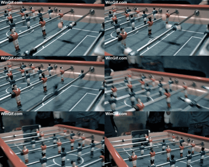
What a loaded word. If I’m being honest, it’s almost to the point of overuse. coLab believes in that word, though. To us, community is what grows when people are working towards common goals. You can spot community in the wild if you look close enough. It’s the thread connecting you, your coworkers, your hosting provider, and your barista. It looks like a conversation shared over lunch. It looks like a business tip shared with a fresh face. It’s a five minute foosball game in the middle of the day to blow off steam.
Collaboration
I love that coLab members don’t compete, in the traditional sense. Instead of cuthroat competition for gigs we pass opportunities amongst one another. Folks are always hiring one another for small jobs. We pool our networks together to create a real-life LinkedIn. In the past we’ve had people pair up and build entire companies together. Successful ones, at that.
Sharing
Sharing space leads to sharing experiences which leads to a shared history. We’ve created a space that encourages people to share as much as they can, whenever they can. We share tips, tools, and techniques with one another. Shared experiences strengthen relationships, so we host innumerable events.
Overlap
Standard printing uses four inks: cyan, magenta, yellow, and black. Alone, each ink colour can only print itself. Mix the inks though, and the possibilities open up. The same goes for people, their fields, and their passions. Sure, you can try to make an incredible and game-changing business alone in your home office. You’ll find more success mixing with people with different jobs, fields, and skills than you will alone. Ideas open up, and new solutions you’ve never dreamed of get suggested by people you’d never think to ask. There’s a quote from my close friend Cynthia Ann Stephanie Lauper that sums it up well. “So don’t be afraid to let them show | Your true colors | True colors are beautiful | Like a rainbow”
How’s That Make a Logo?
After rereading those five words for the hundreth time, it hit me that the solution was right in front of me. The plus sign in our name had it all. Isolating the plus sign out from the middle of our name, I got to work on it.
I realized the cross shape of the plus sign can become or mean a crazy amount of things. A plus sign, for growth. A medic cross, for help and health. Separating that plus, or cross, into overlapping shapes brought out even more options. Now it became an intersection, a snippet of a city map. The magenta corner being the highlighted route on your GPS to success. The rounded corners on one side of the shapes contrast with the sharp angles inside. This makes them resemble angle brackets, referencing our beginnings in the tech community.
For the name I used a chunky, but slightly curvy, sans-serif called Isidora Bold. It’s less fragile than our previous typeface, but not so strong that it’s imposing. It’s got authority, but it’s not institutional. There’s levity and character, but not goofiness. It was perfect. Mostly. I made some modifications to the uppercase “L” in our logo, but it’s a beautiful typeface as-is.
If the visual balance was off in our logo, the first feeling people get when they saw coLab could be unease. That wouldn’t be great. It was crucial to me to keep the weight feeling consistent between the wordmark and the logomark. That meant balancing the visual weight. It meant making sure the strokes on the shapes felt in-line with the width of the letters.
Before I Go
On a personal note, this project was quite close to my heart. I attribute a lot of my success to coLab. Being around the space has opened countless doors for me. That’s why I wanted this new logo to be something that every coLab member can be proud of and rally behind. I wanted it to be a symbol summarizing all the thoughts, goals, and history of our organization. I want it to be something that grows with coLab and can last into the future alongside it. Have I done all that?
You tell me.
